Redesigning MyBillBook's Upgrade Experience for SMBs

MyBillBook gives small businesses a digital alternative to pen-and-paper bookkeeping. While every new user gets a 14-day free trial, the trial-to-paid conversions had stalled.

Most trial users were small business owners with limited technical familiarity. They struggled to understand when they needed a paid plan, and the pricing page made choosing one feel overwhelming.

LOCATION

Bengaluru

PLATFORM

Desktop app

TOOLS

Figma, Useberry

THE DESIGN

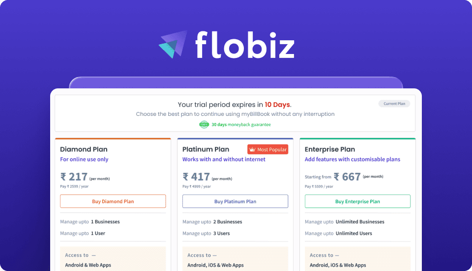
I redesigned the upgrade journey for better discoverability, simpler plan comparison, and clearer pricing communication. Replacing the dense comparison table with a card-based layout made it easier for non-technical users to choose the right plan.

RESULT

Pricing page discovery
(12% to 56%)
Pricing page discovery
+0.0x
+0.0x
Trial-to-paid conversions
(8% to 12%)
Trial-to-paid conversions
+0%
+0%
Bounce rate
(80% to 52%)
Bounce rate (80% to 52%)
-0%
-0%

Why Users Weren't Upgrading

To investigate the massive 92% trial drop-off rate, I used funnel analysis and user interviews to uncover 2 critical UX failures driving this churn.

To investigate the massive 92% trial drop-off rate, I used funnel analysis and user interviews to uncover 2 critical UX failures driving this churn.

To investigate the massive 92% trial drop-off rate, I used funnel analysis and user interviews to uncover 2 critical UX failures driving this churn.

1. The Discovery Problem

INSIGHT

73% of users never visited the pricing page during their trial.

73% of users never visited the pricing page during their trial.

73% of users never visited the pricing page during their trial.

CAUSE

As the pricing link was buried inside settings, 68% of users were unaware they needed a paid plan to keep using core features, making the trial expiry feel like a sudden lock-out.

As the pricing link was buried inside settings, 68% of users were unaware they needed a paid plan to keep using core features, making the trial expiry feel like a sudden lock-out.

As the pricing link was buried inside settings, 68% of users were unaware they needed a paid plan to keep using core features, making the trial expiry feel like a sudden lock-out.

2. The Cognitive Overload Problem

INSIGHT

The few users who found the pricing page left in 37 seconds.

The few users who found the pricing page left in 37 seconds.

The few users who found the pricing page left in 37 seconds.

CAUSE

Unlike enterprise SaaS buyers, most users were busy shop owners evaluating plans quickly between operational tasks. Long feature comparisons made it difficult to identify the best fit for their business needs.

Unlike enterprise SaaS buyers, most users were busy shop owners evaluating plans quickly between operational tasks. Long feature comparisons made it difficult to identify the best fit for their business needs.

Unlike enterprise SaaS buyers, most users were busy shop owners evaluating plans quickly between operational tasks. Long feature comparisons made it difficult to identify the best fit for their business needs.

The UX Strategy: Clarity Over Urgency

Early explorations used aggressive urgency patterns and feature-heavy comparisons, but testing showed they increased hesitation instead of accelerating upgrades. The final direction focused on clarity: simpler plan comparisons, and upgrade prompts that felt helpful rather than pushy.

Executing the Redesign:Validating & Iterating

To ensure the new card-based layout actually solved the cognitive overload problem, I built an interactive prototype and tested it with users approaching the end of their 14-day trial, the highest-intent moment. Each round of testing shaped the next iteration.

TESTING PROTOTYPE

Watching real users navigate this new upgrade flow in real-time allowed me to refine the pricing experience over several rigorous iterations:

Watching real users navigate this new upgrade flow in real-time allowed me to refine the pricing experience over several rigorous iterations:

Watching real users navigate this new upgrade flow in real-time allowed me to refine the pricing experience over several rigorous iterations:

Iteration 1: From Matrix to Cards

The original horizontal matrix made comparison exhausting. Switching to vertical cards made the key plan differences easier to spot during upgrades.

I deliberately hid some advanced features upfront. Choosing clarity over completeness reduced user hesitation and made the decision feel smaller.

Iteration 2: Building Visual Hierarchy & Context

Most users hit the upgrade wall too late in the trial lifecycle. Surfacing trial status prominently inside the dashboard improved pricing awareness.

Color-coded pricing tiers made plan differences scannable at a glance.

Iteration 3: The Power of UX Writing

Layout changes alone weren't enough, the language was still too technical. Because internal labels failed for shop owners multitasking between day-to-day operations, rewriting them in plain business terms significantly improved comprehension.

Measuring the Success

Choosing clarity over aggressive sales tactics made the upgrade decision feel straightforwards, even for users with no technical background.

Pricing Discovery Surged to 56% (Up from 12%)

Moving trial status into the dashboard helped users arrive at the pricing page early.

Bounce Rate Dropped by 35% (From 80% to 52%)

Simpler cards and plain-language labels tripled time spent on the page.

Trial-to-paid Conversions Boosted by 50%

A 50% lift in conversions within the 1st release cycle drove an immediate revenue impact for the business.

Lessons Learned

Clarity converts better than urgency

Reducing decision anxiety drove more upgrades than countdown timers or aggressive prompts.

Contextual nudges beat hidden menus

Placing upgrade nudges inside core workflows, rather than hiding them inside account settings, significantly improved pricing awareness.

Small business owners buy outcomes, not features

Enterprise-style tables fail SMBs because they evaluate plans based on business impact rather than technical capability lists.

Connect to Content

Add layers or components to infinitely loop on your page.

Connect to Content

Add layers or components to infinitely loop on your page.

Connect to Content

Add layers or components to infinitely loop on your page.

Building something cool?Let's talk.

Create a free website with Framer, the website builder loved by startups, designers and agencies.